Readings Monthly editor Jessica Au previews our new look newsletter
So you may not know to look at it, but our humble Readings Monthly has been banging on for close to two decades now. Have a look at us in the good old days here.
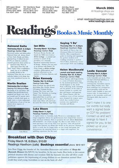
Needless to say, it’s undergone many incarnations during the years and, come 2013, we felt it was time to get the surgical tools out again, this time with the help of the very talented Sonja Meyer, graphic designer and ex-Readings bookseller to boot.
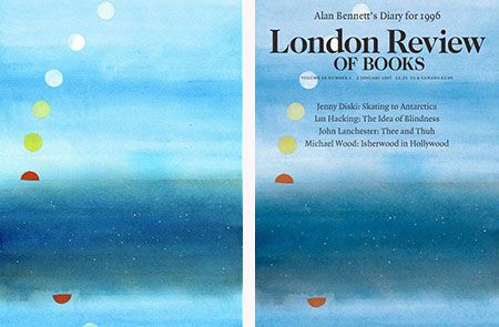
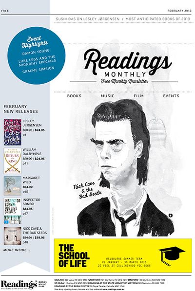
First things first – the cover. After a brilliant suggestion from the great Oslo Davis, we decided to try for an illustrated look each round, in a very, very modest nod to publications like the London Review of Books, The New Yorker and The Paris Review.
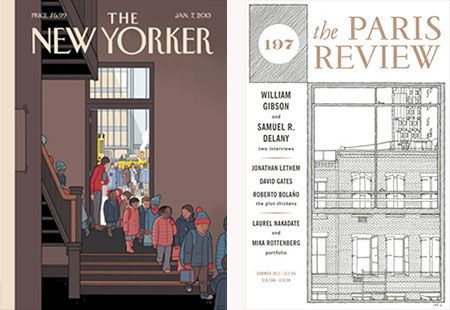
Peter Campbell’s illustrated covers for the LRB; Chris Ware’s cover for The New Yorker; Paris Review No. 197, 2011, illustrated by Matteo Pericoli.
Of course, the choices were seemingly endless. We spent a lot of time walking around A3 sheets of paper, frowning in thought.
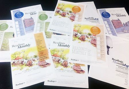
For the masthead, we ended up going with Thirsty Script, a bold, beautiful typeface by Ryan Martinson of Yellow Design Studio, a small outfit based on Wisconsin. From Sonja:
‘The typographic inspiration came from the idea that we needed something a little more fun and contemporary. There are a lot of stylish and ‘trendy’ script fonts around at the moment but I wanted to use one that would not outdate quickly nor be too varied from the old Readings imagery.’
The font itself, fittingly, takes inspiration from both the old and the new – a mix of vintage signage, Wisdom Script, Deftone Stylus and Lobster. Personally, I love the slightly retro-diner-billboard feel – fun and brash, yet somehow still classic.

Oslo Davis once again pulled out all the stops and whipped up a dark, broody portrait of Nick Cave to celebrate his first Bad Seeds album years (according to our music buyer Dave Clarke, it’s reminiscent of Boatman’s Call). Again, I love how grim yet wry his rendition of Cave is – all black suit, skinny tie and sleepy, hooded eyes.

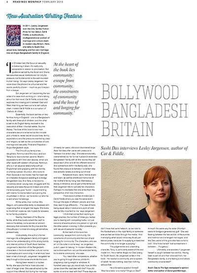
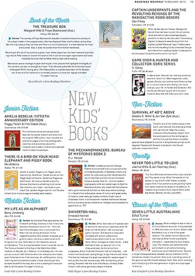
Then it was on to the internals. This was less about dismantling and building it again from the ground up, and more about working around the content with new fonts, colours and knowing use to white space to let the eyes breathe.
We went with Hagin (thin and gangly and arty) for another heading font as well as a combination of Pill Gothic and Swis721 BT for the subheadings and body text – contemporary, clean and simple.
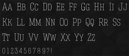
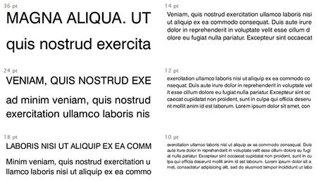
From there, it was a case of fine-tuning. Taking in margins here and there, lightening swatches, adjusting bleeds and all those tiny minutiae of thing that only Sonja or I would notice and angst over.
We still have our usual staples of great reviews by staff and local writers, including our Book of the Month, Inheritance by Balli Kaur Jaswal (Sleepers Publishing), and a profile of Lesley Jørgensen, who won the CAL Scribe Fiction Prize back in 2011 with Cat & Fiddle, by Sushi Das.
But there’s some new fodder in there as well. Our head books buyer, Martin Shaw, kicks us of with his Most Anticipated Reads of 2013, Chris Somerville writes on the anxieties of literary taste and why he lies about his reading choices, and Will Heyward of Readings St Kilda explains the austere beauty of the mundane in Karl Ove Knausgaard’s A Death in the Family for our series of retrospective reviews, What I Loved.
Massive thanks to Sonja, and her creative smarts and vision driving this, and to all the Readings crew for their thoughts and words.
The


