Readings Newsletter
Become a Readings Member to make your shopping experience even easier.
Sign in or sign up for free!
You’re not far away from qualifying for FREE standard shipping within Australia
You’ve qualified for FREE standard shipping within Australia
The cart is loading…


Behind every typeface is a story - who designed it, and why? What are its distinctive characteristics, and what cultural baggage does it carry?
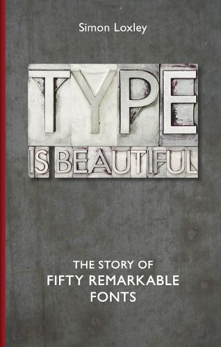
This book explores fifty of the most remarkable typefaces, dating from the birth of European printing in the fifteenth century (and the type used in the Gutenberg Bible - the first significant book to be printed in Europe) to the present day. It features key examples in the aesthetic development of typography (Caslon, Baskerville, Bodoni) and those fonts which have made a significant impact on the wider world.
Many fonts have added style to something culturally important (such as Johnston Sans on the London Underground), or assumed a cultural significance of their own, sometimes by accident. The designer of Comic Sans, for example, created the typeface for use in speech bubbles for a Microsoft programme, never expecting it to become one of the world’s favourite - and also most maligned - fonts.
Through the fonts this book also examines the often colourful lives of the key designers in the evolution of typography: Johannes Gutenberg, William Caslon, Nicolas Jenson, Stanley Morison and William Morris, among others - including one who threw his unique set of metal type into the Thames to prevent others from misusing it - and the enduring influence they have had on print culture.
Of equal appeal to general readers, designers and typographers, this book is a vibrant cultural guide to the aesthetic choices we make in order to spread the word.
$9.00 standard shipping within Australia
FREE standard shipping within Australia for orders over $100.00
Express & International shipping calculated at checkout
Behind every typeface is a story - who designed it, and why? What are its distinctive characteristics, and what cultural baggage does it carry?
This book explores fifty of the most remarkable typefaces, dating from the birth of European printing in the fifteenth century (and the type used in the Gutenberg Bible - the first significant book to be printed in Europe) to the present day. It features key examples in the aesthetic development of typography (Caslon, Baskerville, Bodoni) and those fonts which have made a significant impact on the wider world.
Many fonts have added style to something culturally important (such as Johnston Sans on the London Underground), or assumed a cultural significance of their own, sometimes by accident. The designer of Comic Sans, for example, created the typeface for use in speech bubbles for a Microsoft programme, never expecting it to become one of the world’s favourite - and also most maligned - fonts.
Through the fonts this book also examines the often colourful lives of the key designers in the evolution of typography: Johannes Gutenberg, William Caslon, Nicolas Jenson, Stanley Morison and William Morris, among others - including one who threw his unique set of metal type into the Thames to prevent others from misusing it - and the enduring influence they have had on print culture.
Of equal appeal to general readers, designers and typographers, this book is a vibrant cultural guide to the aesthetic choices we make in order to spread the word.