Readings Newsletter
Become a Readings Member to make your shopping experience even easier.
Sign in or sign up for free!
You’re not far away from qualifying for FREE standard shipping within Australia
You’ve qualified for FREE standard shipping within Australia
The cart is loading…


Explore different perspectives and approaches to create more effective visualizations
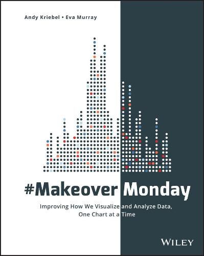
This book is an extension of that project, featuring a variety of makeovers that showcase various approaches to data communication and a focus on the analytical, design and storytelling skills that have been developed through #MakeoverMonday. Paging through the makeovers ignites immediate inspiration for your own work, provides insight into different perspectives, and highlights the techniques that truly make an impact.
Explore the many approaches to visual data communication Think beyond the data and consider audience, stakeholders, and message Design your graphs to be intuitive and more communicative
Assess the impact of layout, color, font, chart type, and other design choices
Creating visual representation of complex datasets is tricky. There’s the mandate to include all relevant data in a clean, readable format that best illustrates what the data is saying-but there is also the designer’s impetus to showcase a command of the complexity and create multidimensional visualizations that look cool. #MakeoverMonday shows you the many ways to walk the line between simple reporting and design artistry to create exactly the visualization the situation requires.
$9.00 standard shipping within Australia
FREE standard shipping within Australia for orders over $100.00
Express & International shipping calculated at checkout
Explore different perspectives and approaches to create more effective visualizations
This book is an extension of that project, featuring a variety of makeovers that showcase various approaches to data communication and a focus on the analytical, design and storytelling skills that have been developed through #MakeoverMonday. Paging through the makeovers ignites immediate inspiration for your own work, provides insight into different perspectives, and highlights the techniques that truly make an impact.
Explore the many approaches to visual data communication Think beyond the data and consider audience, stakeholders, and message Design your graphs to be intuitive and more communicative
Assess the impact of layout, color, font, chart type, and other design choices
Creating visual representation of complex datasets is tricky. There’s the mandate to include all relevant data in a clean, readable format that best illustrates what the data is saying-but there is also the designer’s impetus to showcase a command of the complexity and create multidimensional visualizations that look cool. #MakeoverMonday shows you the many ways to walk the line between simple reporting and design artistry to create exactly the visualization the situation requires.